Dish spotlight
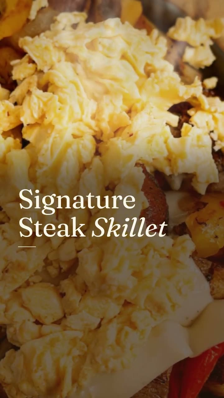
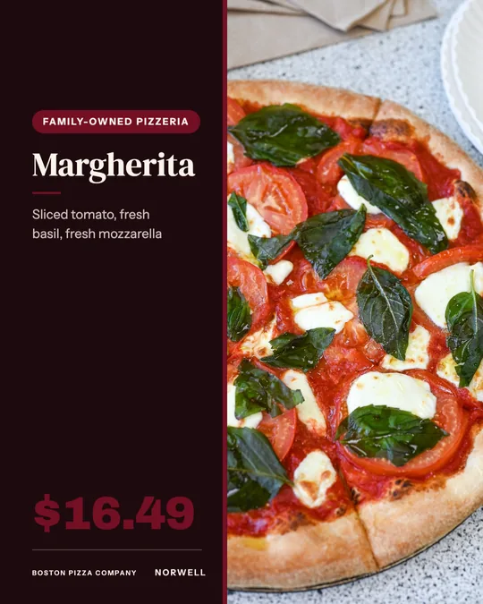
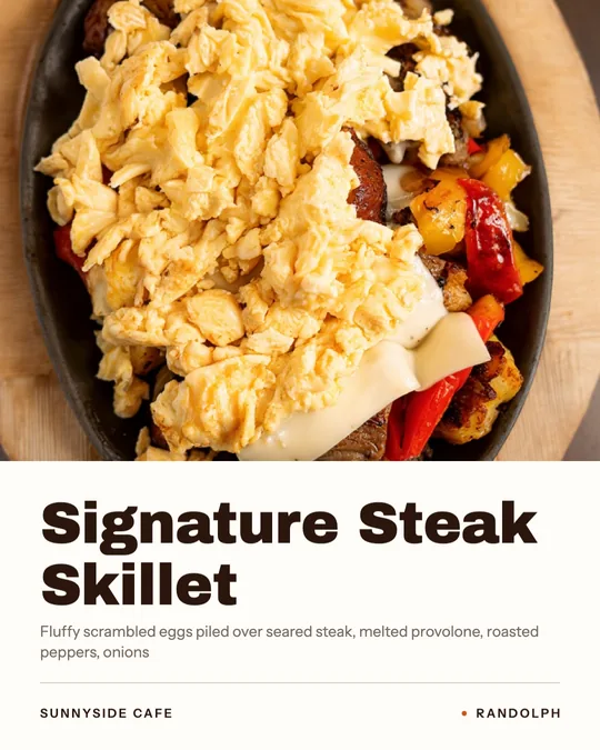
The photo fills the top of the post edge to edge, with the dish name in heavy type and the full menu description underneath. It lets the food and the ingredients do the talking.
Give one dish the whole post, with the menu description that makes people order it.
A chef's special post is a recommendation. It says: if you only try one thing here, try this. That makes it one of the most useful posts a restaurant can make, and one of the most wasted when it's a blurry photo captioned "Special today!!".
Studio has two designs for it. Dish Spotlight gives the photo most of the post and prints the full menu description beneath the name. Chef's Pick frames the dish in a circle with a quieter layout that reads like a personal pick. Both pull the dish name and description from your menu, so the words are the ones your kitchen already signed off on.
Sunnyside Cafe made both for the same dish, its Signature Steak Skillet, which is a good way to see how the two differ. Both are template designs and use no credits. For a moving version, pair them with a dish story video of the same plate.
The photo fills the top of the post edge to edge, with the dish name in heavy type and the full menu description underneath. It lets the food and the ingredients do the talking.
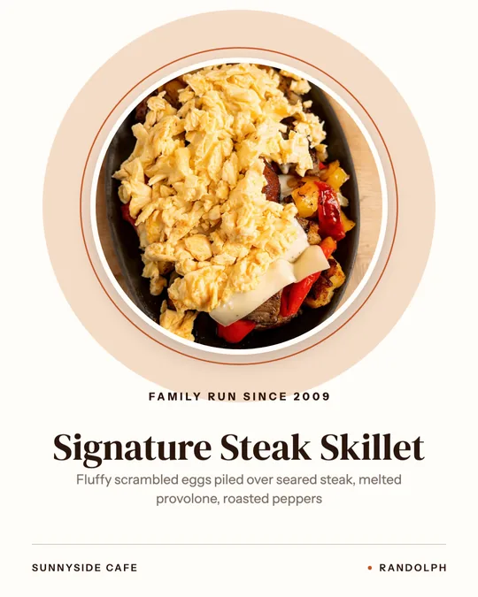
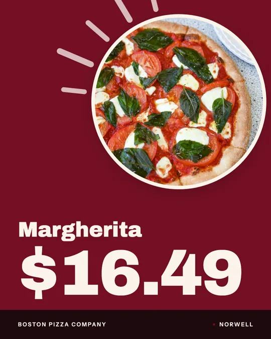
The dish sits in a round frame on a light background, with a short line about the restaurant, a serif name and the description below. Quieter, a little more formal, and it looks like a recommendation.
Rendered in Studio for real Servestack restaurants, from their own photos and menus.
Shown with permission: Sunnyside Cafe (Randolph, MA) and Boston Pizza (Norwell, MA).
Choose the one dish you'd tell a friend to order. Read its menu description in Studio and make sure it names what's actually on the plate.
Dish Spotlight for a full, edge-to-edge photo, Chef's Pick for a framed, calmer look. Adjust the words if the description is too long for the layout.
Post the design to your feed, and schedule a dish story video of the same dish a day or two later so the pick shows up twice.
Look at your photo first. If it's a great close shot that fills the frame, use Dish Spotlight. The layout runs the photo edge to edge, and a strong photo carries it. If your photo is decent but has a messy background or table edges, use Chef's Pick. The round frame crops to the dish and hides everything around it.
Tone matters too. Dish Spotlight is louder and suits a diner, a pizzeria or a sandwich shop. Chef's Pick is quieter and suits a dish with a story, a higher price, or a restaurant where the chef is part of the draw.
Both designs print the menu description under the name, so it has to earn its space. Sunnyside's reads like a list of reasons to order: scrambled eggs over seared steak, melted provolone, roasted peppers. That's the model. Name the main ingredients and how they're cooked, and leave out words like "delicious" or "mouthwatering" that every menu uses.
If your description runs long, trim it in Studio before you make the post. The same shorter version then reads better on your price cards and in dish videos too.
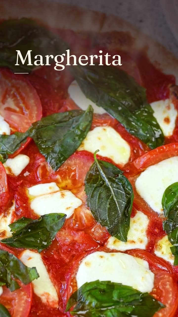 Dish story videoOne photo of one dish, turned into a short video with its menu words on screen.
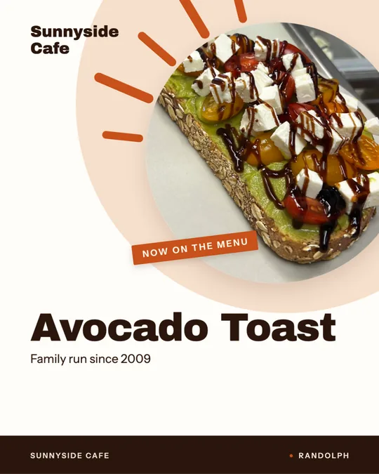 Window sign designOne design for the glass out front and the feed, so walkers and scrollers see the same dish.
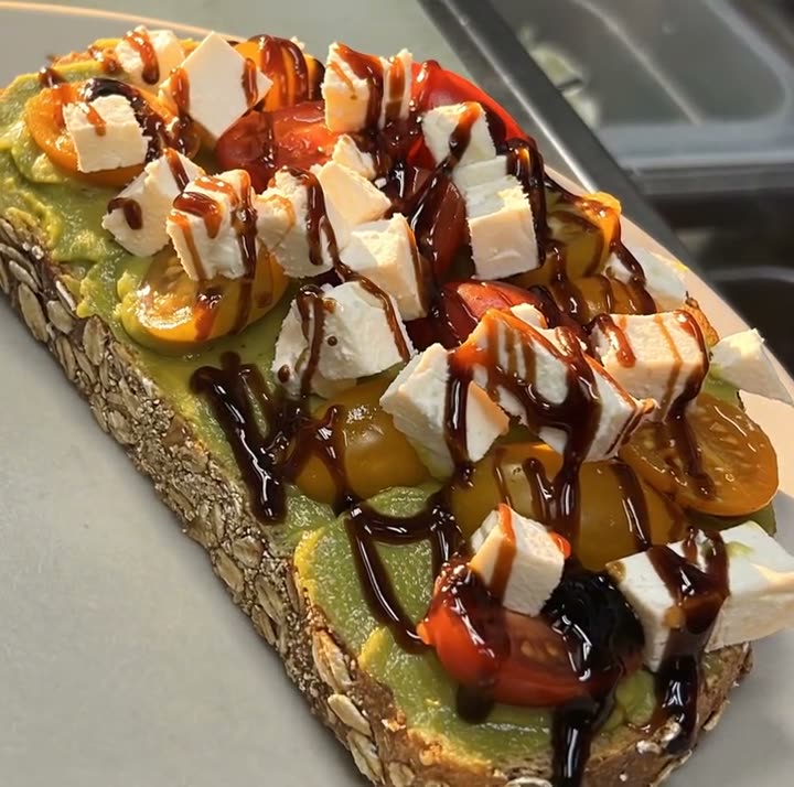 Light Reveal AI videoThe light moves across the plate the way it does in a food commercial. The plate is yours.
$49/month with 600 credits included. Already on Servestack Starter or Scale? Studio is included.