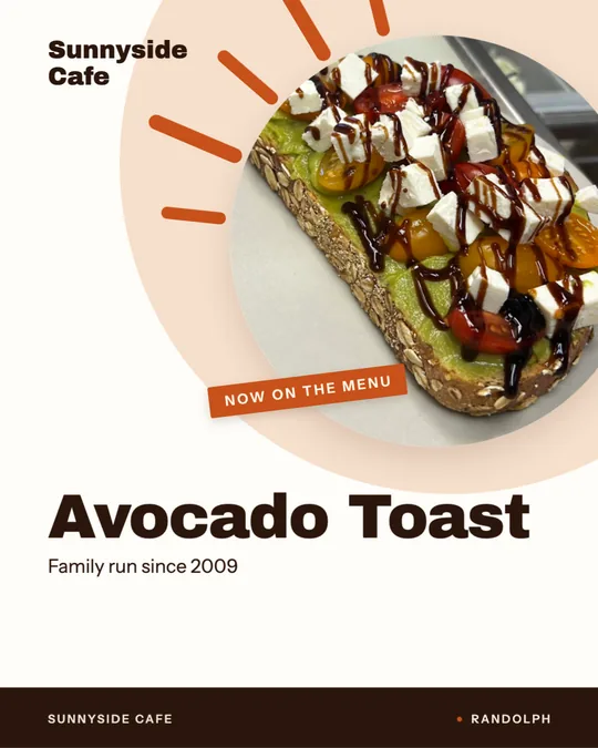
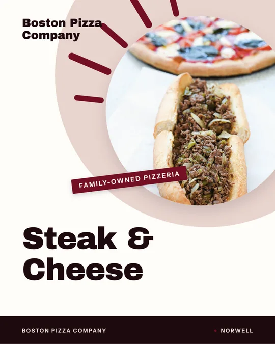
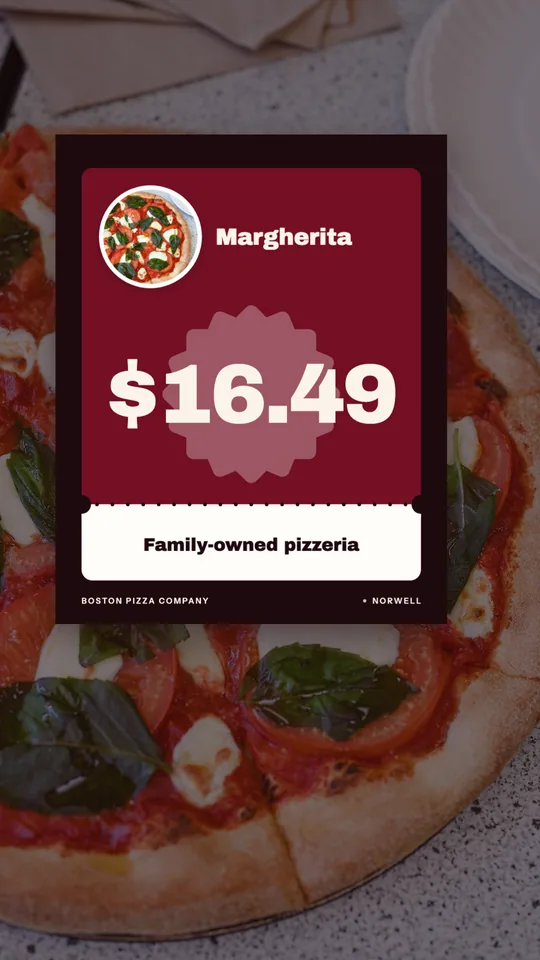
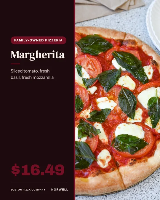
That calls for tighter editing than a full dining menu, and a clear route to order.
Edit down to what travels well
Cut the menu to what you deliver and pack well, not everything the kitchen can do. Dishes that arrive soggy or cold do not belong on a takeout flyer. Keep each group to a few items and mark your best sellers. A shorter menu is faster to scan and cheaper to keep accurate.
Headline ideas
The headline is mostly a promise.
- Takeout menu: ready in 20 minutes.
- Our most ordered dishes, all in one place.
- Keep this on the fridge.
- Order direct from the kitchen.
- Lunch specials, Monday to Friday.
Page hierarchy
Put the restaurant name and ordering method at the top, because that is what people need most. Follow with the sections in the order a customer thinks: starters, mains, sides, drinks. Highlight a small number of favorites with a note or a small icon. Print the hours, address and a QR code at the bottom, and leave white space between groups.
Sizes and sides
A letter-size sheet, 8.5 by 11 inches, printed on both sides, fits a full takeout menu with room for ordering details. A half-letter 5.5 by 8.5 inch version suits bag inserts and door drops. Keep prices consistent with your online menu so nobody sees two different numbers. Version your files and replace stacks when prices change.
Print and screen versions
Make a PDF for email and a single image for social so people can save it on a phone. For a story or feed post, show only the top dishes and send people to the full menu online.
Where to distribute
Put one in every takeout and delivery bag. Drop stacks at offices, hotels and apartment lobbies with the owner's permission. Leave a few at nearby shops that get lunchtime foot traffic, and mail or hand-deliver to the blocks inside your delivery radius.
Menu flyer checklist
- Prices match the register and your online menu.
- Spelling checked on every dish.
- Hours and address clear.
- QR code to your ordering page, tested.
- Date or version in the file name.
Pricing and wording
Show prices in a plain, consistent style, without currency symbols stacked down a column. Keep descriptions to a line. State any delivery fee, tax note or minimum clearly, so there are no surprises at checkout. If an item can be customized, say how.
Mistakes to avoid
Printing the full dining menu, using a font too small to read in dim light, and listing items that are no longer available are the usual faults. Another is forgetting to date the file, so an old version keeps circulating. Review the flyer every time the kitchen changes a dish or the register changes a price.
Using a QR code well
Place the QR code where a thumb can reach it on a phone screen picture, with a short label such as order online. Link it straight to your ordering page, not your home page. Print it at least about one inch square, give it a quiet border of white space, and test it on more than one phone before printing. Never place it over a photo or a busy background, since scanners fail on low contrast.
Making it in Studio
Studio can import your dishes from your website or read a printed menu from a photo, then lay out a letter-size menu in your brand. Review every price and description before printing.